


branding
social media


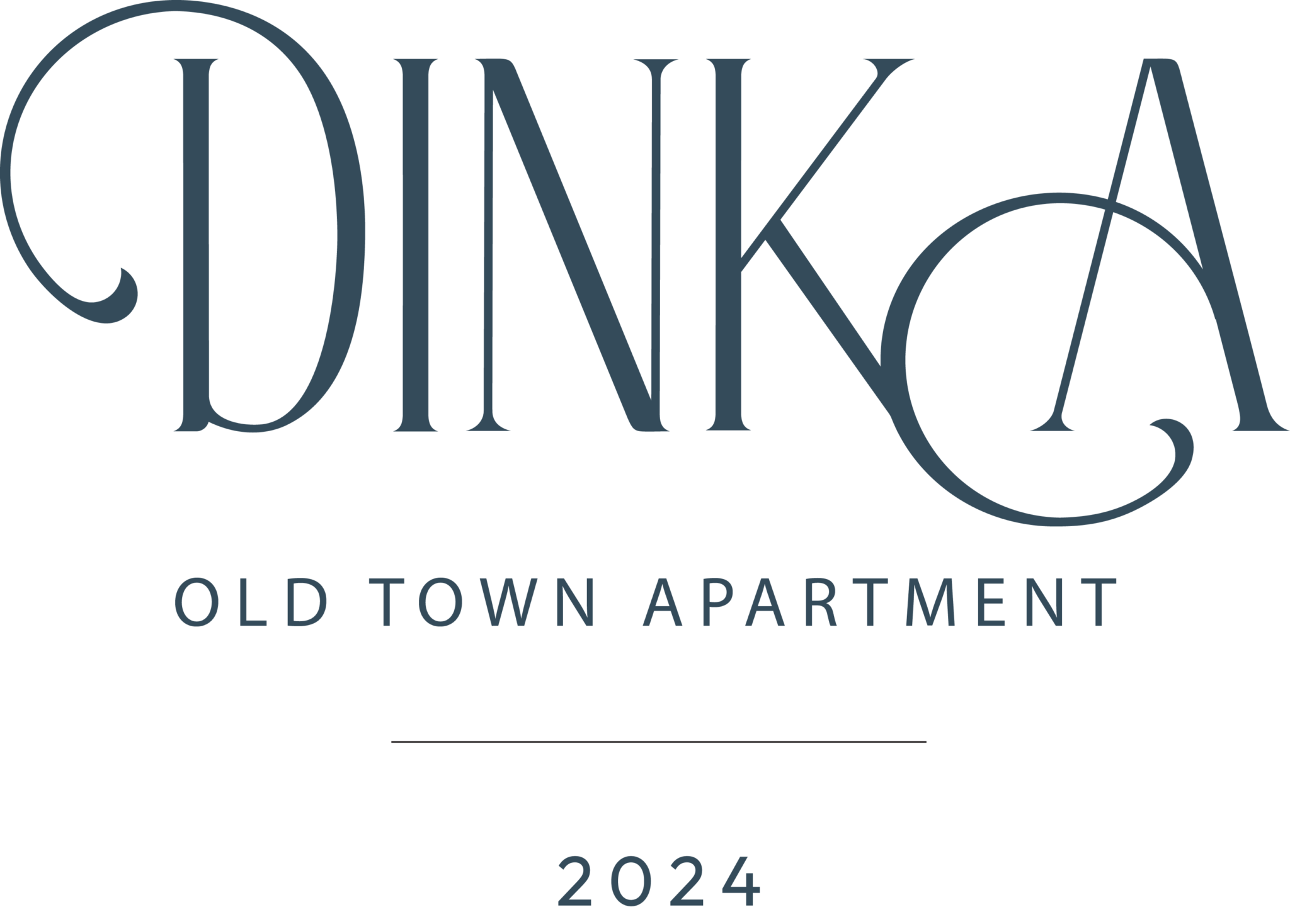


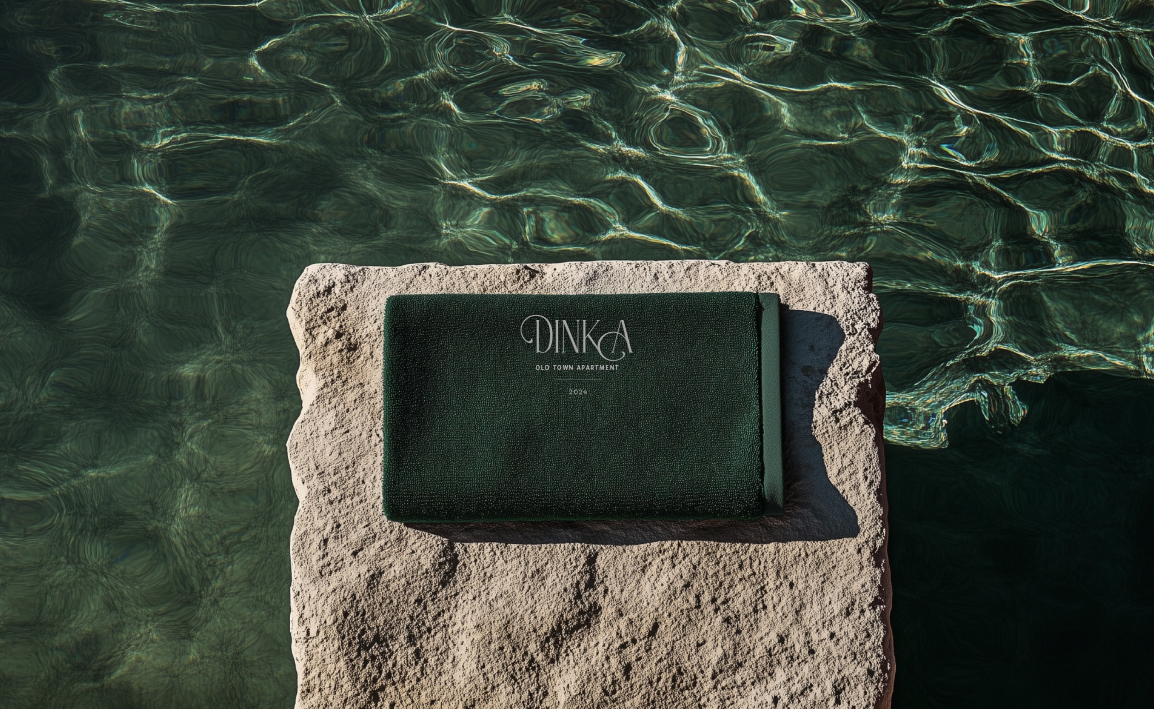
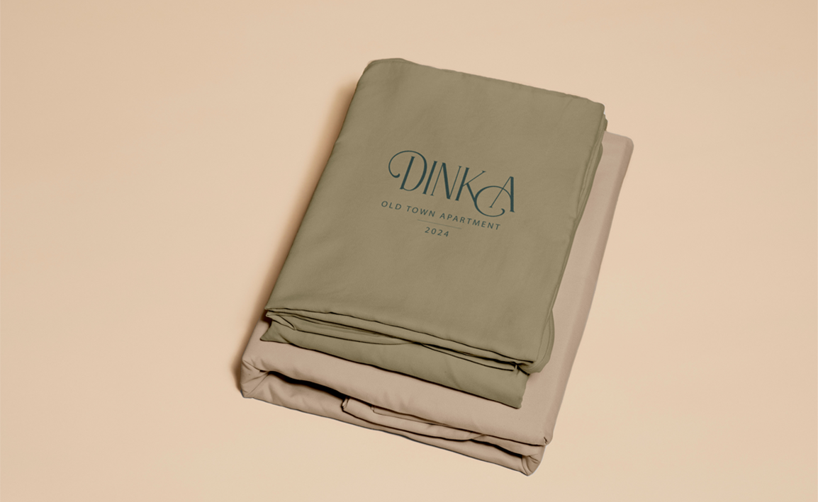
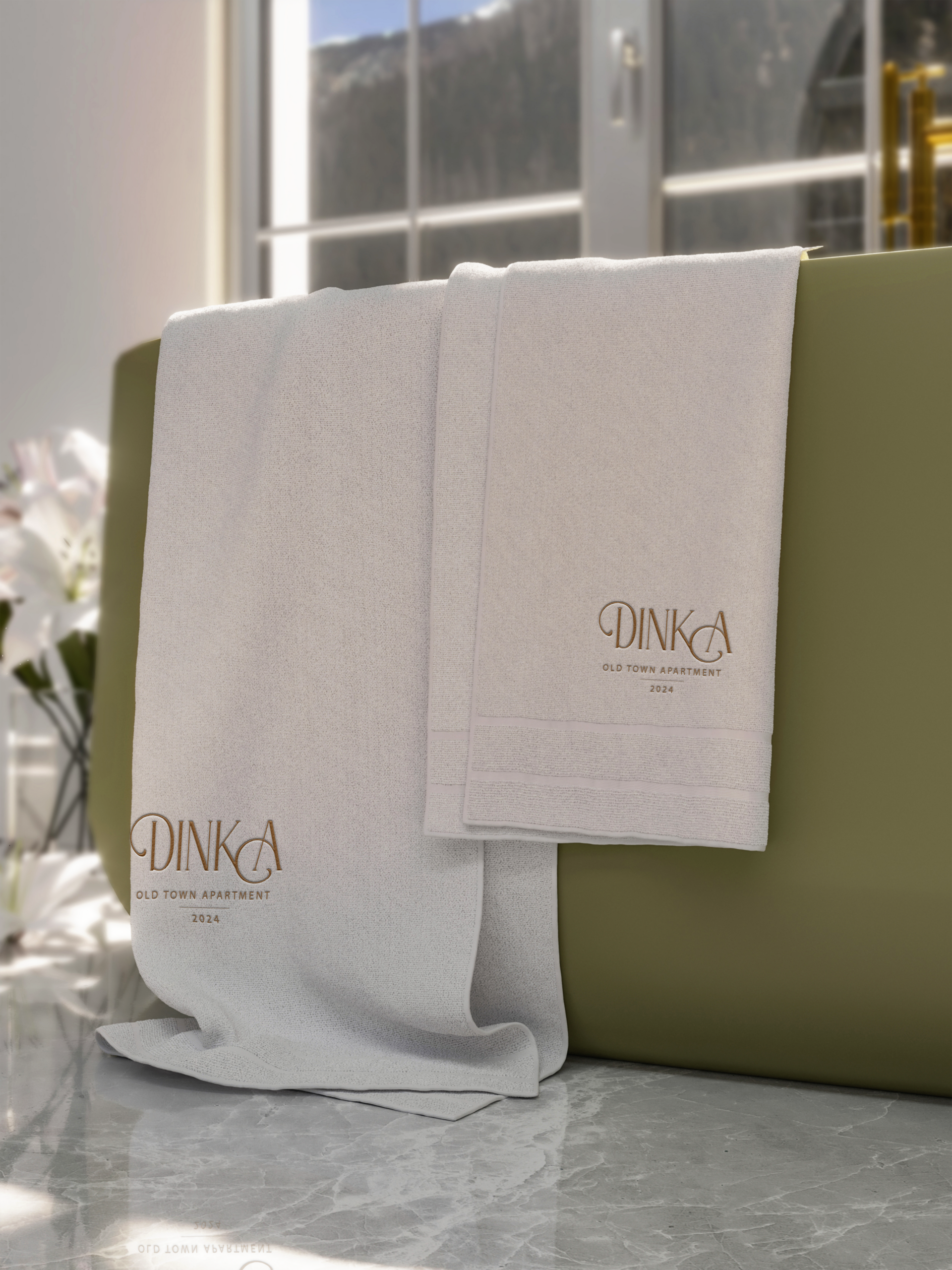
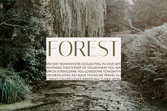
This project represents the branding and visual identity design for Dinka Old Town Apartment, a seaside accommodation created to offer a calm and authentic stay experience. The brand was developed to reflect the apartment’s timeless character, coastal atmosphere, and sense of simplicity, translating these qualities into a cohesive and recognizable visual language.
The vision was to create a calm and timeless brand identity for Dinka Old Town Apartment — one that reflects the authenticity of the old town and the relaxed rhythm of coastal living. The goal was to design a visual language that feels modern yet unobtrusive, allowing the space itself to remain the focus while enhancing the overall guest experience through clarity, warmth, and consistency.
The main challenge was to balance modern design with the character of a historic seaside setting. The brand needed to feel refined and contemporary without losing its sense of place or appearing generic. Achieving a visual identity that works seamlessly across different touchpoints, while remaining subtle and welcoming, was essential.
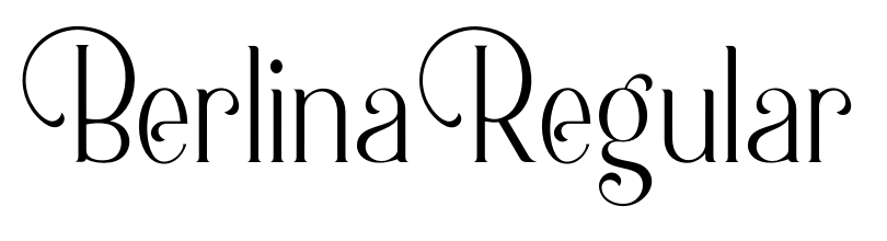
The solution was a cohesive branding system built around simplicity and restraint. Through a carefully considered logo, typography, color palette, and visual elements, the identity captures the atmosphere of the apartment and its surroundings. The resulting brand feels approachable, recognizable, and timeless, supporting a consistent and memorable experience for guests.